
A trend-setter company over the last 50 years, Urban Outfitters has been focusing on its e-commerce platforms, to deliver new experiences and become a leader in online sales.
As a UI Designer for the team, I worked across all points of the UO digital experience which involved the website, app, emails and in-store devices. Working extensively with multiple teams across the organization, the Anthropologie and Free People’s UI teams, I led the creation of the design system for the new website that launched in 2020, as well as a library cataloguing changes to the digital experiences.
Experience Design
Interface Design
Design Systems
Production Design
Art Direction
Illustration
Motion Graphics
AD - Andrew McQuiston
UX Lead - Lauren Schoonover
CD - James Mackenzie
ECD - Dan Kent
In collaboration with URBN’s UX design teams, Anthropologie’s and Free People’s UI teams and URBN’s development team.

pwa website redesign
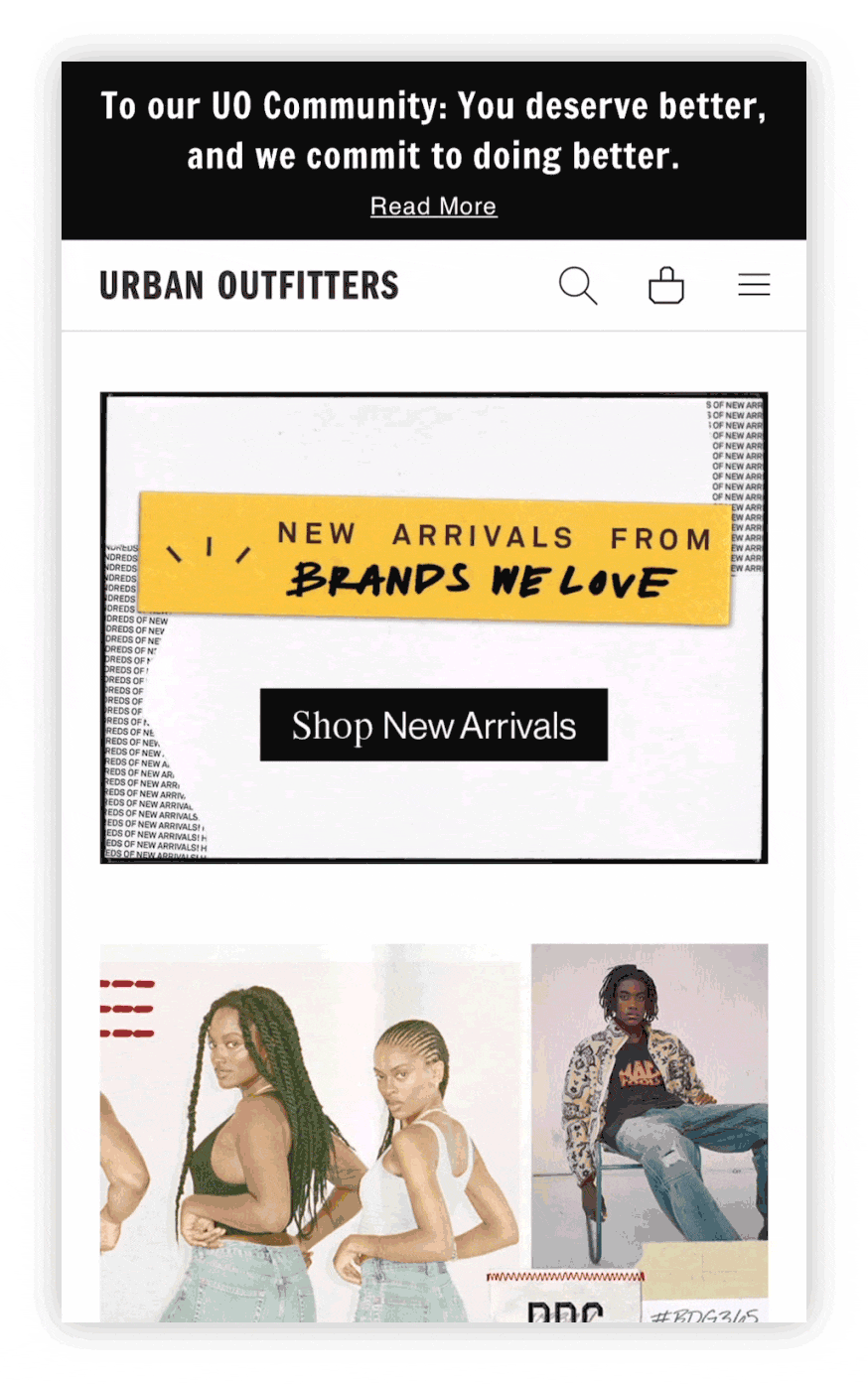
The URBN PWA (Progressive Web App) replatform was a project done as a means to implement a true white label site within the company’s brands, a cleaner code, a better responsive site and an overall faster experience for customers, even those with bad or slow internet connection.
Working alongside the Anthropologie and Free People’s design teams, as well as URBN’s team of UX designers and developers, we established styles, mixins, grids and layouts that would work for the three brands. It was a long process, as this meant having a lot of experimentation to allow each of the brands to keep their style, voice and a site that allows for improved conversion rates.
The PWA experience was launched worldwide on April 13, 2020.


digital stickers
Project developed to allow the UO brand to tap into its customers’ every day life by letting people use stickers to express themselves using quirky, cute and relatable illustrations.
The stickers are available once you download the app, while also being accessible through Giphy, which makes it easier for the customers to use them in other apps like Instagram and Snapchat.
In collaboration with Eleni Trapp and the UO Design Teams


digital style guide
A complete digital style guide was developed for all of the digital platforms – website, apps (Apple & Android), emails, social, and paid media – with the purpose of identifying nuances between them and improving on those to have a solidified digital experience.


Previous
Next